Thursday 11 February 2016

Daisy Meadow in moonrise


This is Daisy Meadow wallpaper in 'moonrise'. Imagine a big, full moon rising against a dusky blue sky. The white motifs brightly pop out from the dark background.


I'm rather loving this colour. My Dad sees it as grey, I see it as blue. 


Grey/blue then...but moonrise sounds better don't you think.


I'm looking forward to seeing it in a large expanse on a wall 


but for now even having the rolls hanging around is making me happy :)


You can order a sample on my website here.

Daisy Meadow wallpaper in sage


This is my new Daisy Meadow wallpaper in sage.  


I wanted to take some close up shots so that you could see all the details. When I visited Norway last year I was so inspired by the wild flowers that covered the fields, hedgerows and gardens...any bit of wild land really. 


I made lots of drawings and took lots of photos


and it's nice for me to look back on them now that the things I captured have found their way to a wallpaper.


I loved the harebells. They are just so delicate.


I have often been asked if I do any of my papers in green so I thought I'd give this one a go. 


It's a soft, greyish green...couldn't be called anything other than sage really!


You can order a sample here on my website. 


Daisy meadow wallpaper in dusk


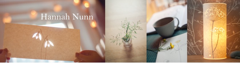
I'm excited about my new wallpapers. I took some pictures yesterday so I could get them up on the website. This design was inspired by the abundance of wild flower meadows that I saw when I visited Norway last year. It features daisies, stitchwort, pignuts, shepherds purse, harebells, vetch, hairgrass, quaking grass,  and all sorts of other grasses that I don't know the names of.


I never thought I'd have a pink product. Pink is not my usual colour but my student intern Oly suggested we give it a try at the factory so we did. I liked it but still I never thought I'd take it to print. 


But as the weeks went by it grew on me and it got good feedback from visitors to my studio. My friend Kate Lycett said that it was the perfect compromise for decorating a little girls room when the girl LOVES pink and the Mum is not so keen. She said something like 'It's not ice cream pink....and it's not knicker pink, it's the perfect tasteful in-between pink that we can both agree on'!


We did joke about calling it 'not knicker pink' but we opted for 'dusk' instead. I love the warmth of it. I love how it is the same soft tone as newly plastered walls. 

Here it is on the website and you can order an A4 sample of it here to see the colour for yourself.

I hope you like it as much as me.

Tuesday 9 February 2016

Little wren and butterfly...


It's such a dark time of year here so we need to make our homes and cosy as we possibly can to see us through until Spring (I can feel it coming, can you?). Candles always do it for me.


These two little candle cover designs, Wren and Butterfly have been around a while but have never quite made it onto my website. Yesterday I fixed that and now you can find them here and here :)

Related Posts Plugin for WordPress, Blogger...