Yesterday we went to the wallpaper factory to colour test my Charlotte's Garden design.
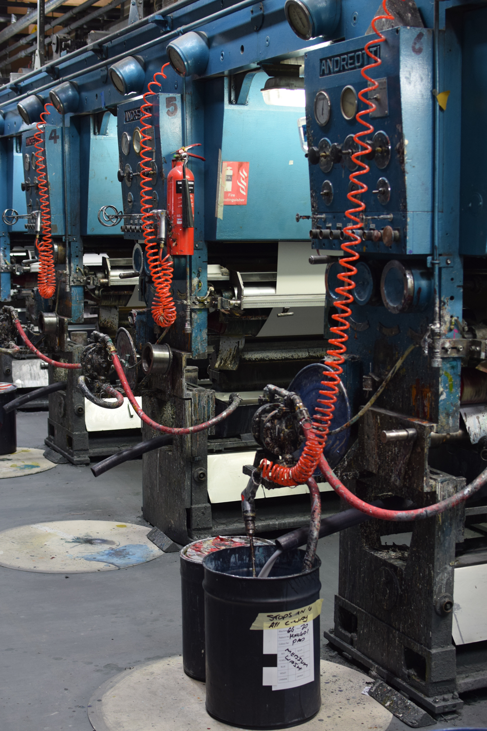
My papers are printed with a gravure cylinder which is where the design is etched into metal.
It's always lovely to see these cylinders. They are works of art in themselves.
This is Shane, our colourist, hiding behind the print machine. He also worked on the colours for
Paper Meadow so it was nice to work with him again.
Ahead of time I give him some rough ideas of what I would like to achieve with my colours and on arrival we are greeted with a few first go's as a jumping off point.
Throughout the course of the day we gradually refine the colours. A little warmer, cooler, greyer, dirtier, brighter, up, down, thicker or thinner.
It's incredible as all the colours are mixed by hand. A squeeze of yellow, a squeeze of blue, a blob of red. he is highly skilled and can find the colours you want just by showing him a photo or a paint chip.
The colours are mixed in paper cups

and the ones we like are diligently stored and recorded on these test cards.
I wanted to find a rich green like the ones used on all the
Bronte Parsonage products so we played around with that first.
My Mum had the idea of creating a blue, like you find on
cyanotypes ( I
made some years ago using the same fritillary motif) and we refined that until we found a blue which I loved. It has a cyanotype feel with all the silhouettes in different tonal varieties. It was my favourite of the day. I'm going to call it 'Inkwell'. It is Bronte inspired after all.

Then I wanted to create a soft mid grey and we spent a lot of time experimenting with that playing with the subtleties of different greys.
We also hit upon a much softer green which still fits in with the Bronte products but is much softer on the eye.
By late afternoon I had found the three colours that I set out to find but with some time left to spare we experimented with some yellows too.
I really like the yellow and I love how it sits with the grey and the blue but I'm not sure I will take it to print.
I'm very excited to go back to the factory for the print day on the 28th June.